INSIGHTS | October 1, 2014
Virgin America's Redesign: Through the Looking Glass
The primary tenet of good experience design is user-centricity. This is our rallying cry; our creed; our passion. Through a deep and meaningful understanding of people, we are able to define interactions that meet their needs and help craft experiences that they love. No product or service should ever be defined behind closed doors, disconnected from the customers expected to use it. In an ever-evolving digital world, a user-centered focus becomes more and more important.
That being said, when did we decide to stop having fun?
Every year, our brethren across other fields of design gather to revel in audacity. At fashion shows, concept car shows and interior design competitions, designers push limits, comfort zones and sometimes even the boundaries of good taste, all to explore the possibilities of design. These concepts rarely reach the market, but elements of them almost always do. They show up as belt buckles, in car consoles or as back-splash patterns. Sometimes being bold pushes you in new ways, and even if the whole doesn’t measure up, the parts were worth the trip.
Which brings us to the redesign of the Virgin America website.
One of the most powerful forces at play in the human mind is convention. It’s a foundational heuristic of UI design. Convention is the reason gas pedals are to the right and brake pedals are to the left. It’s the reason that form fields look, feel and behave essentially the same way across websites, platforms or applications. It’s also the reason that all of the major airlines have, at a basic level, the same basic structure, flow and process.
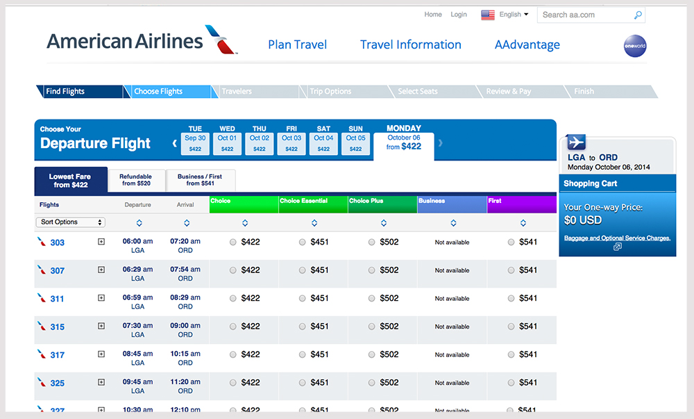

Airports are selected, dates are entered and number of passengers are input, all following the same flow. There are subtle variations: form fields versus overlays versus dropdowns versus radio buttons. After inputting their dates, destinations, etc., customers select flights from a list (if a return trip is required, they then select it from a similar list). They sign up or login, pay, and so on and so forth. It is so consistent across sites that customers who are able to complete the process at one site should have very little trouble completing it at another.
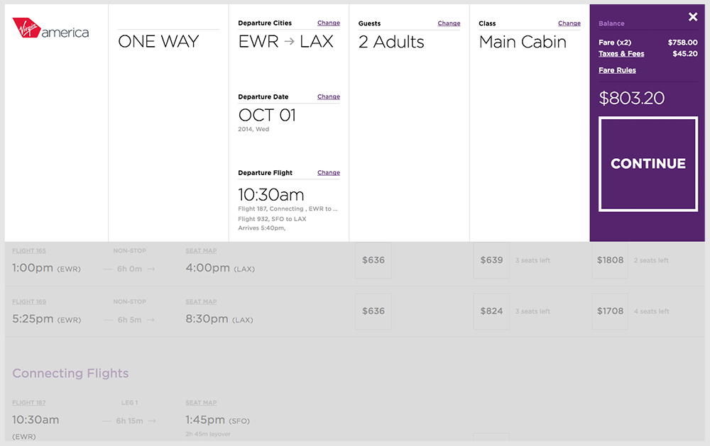
Virgin America has turned this model on its ear.

First, Virgin has made the first step of the booking process the primary focus of the page. There is no overwhelming imagery, no ads and no distracting elements competing for attention. All that is asked of the user is to select a destination. The departure city is geo-located and available destinations for Virgin are displayed (with an option to reveal more, where applicable).
As the user progresses through the booking process, each selection point is rendered as a new “section” within an ever-expanding page. It’s surprisingly nimble and feels faster than a full page-load. Previous selections are also rendered across a toolbar locked at the top of the page. After making an entry or selection, an animated confirmation message populates across the header confirming the choice.


Each step of the booking process is broken out across multiple steps. This makes for more sections to move through, but it also minimizes the amount of required interaction on each section—an interesting trade-off that works in Virgin’s favor by ensuring that customers are able to focus entirely on single selections. Error messaging across the site is practically non-existent, as Virgin has opted to focus on prevention rather than remediation. For example, while selecting the number of passengers, it’s impossible to proceed with zero passengers. Within form fields, a dynamic button state (with an animated indicator) both prevents the user from proceeding, as well as informing them what to do. Validation messaging appears within relevant fields, with global messages handled in the header messaging space (with a boldly colored background that demands attention).


Across the flow, there are a number of interesting, and sometimes novel, interactions being presented. Some are genuinely clever, while others just functionally sufficient. The use of friendly, and occasionally cheeky, language contributes to the playfulness of the design. All of these elements are working in the site’s favor.
Where it starts to breakdown is in scenarios that require customers to go backward in the flow. Because of the continuous page model they’ve employed, one might think that moving backward in the flow would be as easy as scrolling up the page. However, the experience of moving backwards is not as seamless as it would appear. Often, I found myself deposited in an unexpected place, uncertain of where I needed to go to make modifications (from changing flights to changing my seat). The progress bar across the header, while good for a status indication, is not an effective navigable structure.
Further, a pull-down menu serving as a summary of the itinerary is accessed from an unexpected place (the running total for the trip in the header) and contains very little information beyond what displays in the header already. Where this is an opportunity to provide a more comprehensive view of the itinerary (one with clearly defined actions for making updates or changes), instead we find limited, nondescript and almost purposefully undetailed information with little indication of the actions that can be taken.
If nothing else can be said, the Virgin redesign is an audacious experiment. It has pushed the boundaries of convention in some very significant ways. It is also an experiment where the parts are better than the whole. While I admire Virgin’s design team for being willing to take the leap and marvel at the places where it does work very well, I only wish they’d have gotten it in front of more of their customers before going live.
When designing processes as complex as booking flights, it’s important to remember that most customers don’t care if your design is clever. They just want something that works.
Update: After this article was published Virgin America was acquired by Alaska Air.