INSIGHTS | February 11, 2015
Meeting WCAG Color Contrast Guideline 1.4.3: Are You Doing It Right?
At quick glance, the Web Content Accessibility Guidelines (WCAG) 2.0 Color Contrast (Minimum) Guideline 1.4.3 seems to be very clear and straightforward. However, there are two nuances that trip many people up. This article shows you what they are and how to successfully meet this guideline.
The WCAG Color Contrast 1.4.3 Guideline
First, let’s take a look at the WCAG color contrast guideline as it stood on January 24, 2015.
1.4.3 Contrast (Minimum): The visual presentation of text and images of text has a contrast ratio of at least 4.5 to 1, except for the following: (Level AA)
- Large Text: Large-scale text and images of large-scale text have a contrast ratio of at least 3:1;
- Incidental: Text or images of text that are part of an inactive user interface component, that are pure decoration, that are not visible to anyone, or that are part of a picture that contains significant other visual content, have no contrast requirement.
- Logotypes: Text that is part of a logo or brand name has no minimum contrast requirement.
So far, so good. The previous excerpt from the WCAG website is clear enough. Text that is not considered incidental or logotypes must have a contrast ratio of 4.5 to 1 unless that text is large text, in which case the color contrast only needs to be at least 3 to 1.
You’ve probably felt that you sufficiently understood the WCAG color contrast guideline as it was written and followed the link labeled How to Meet 1.4.3. This page contains a section titled Sufficient Techniques for 1.4.3 - Contrast (Minimum) which leads to the first gotcha...
18 point if not bold and 14 point if bold
The “Sufficient Techniques” section contains two tests:
- Situation A: text is less than 18 point if not bold and less than 14 point if bold
- Situation B: text is at least 18 point if not bold and at least 14 point if bold
While this seems straightforward, there is a subtlety here that is very important to understand and might be missed. Both situations explicitly cite points when defining font size units. The reason this is important to ascertain is in how web browsers render points as opposed to how Photoshop and Illustrator do it.
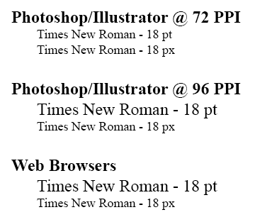
Difference between pixel vs. point font sizes for wcag color contrast guidelinesPhotoshop and Illustrator render points and pixels exactly the same size if the document is set to 72 pixels/inch (ppi) which is the built-in preset. A point is a unit of measure that equals 1/72 of an inch and at 72 ppi, 1 point = 1 pixel, so fonts render exactly the same size. If you were to change the ppi of your document to 96 ppi, then Photoshop would render 18 pt type at 24 px, which is exactly what the web browser does because a screen uses a hypothetical 96 ppi for an assumed reading distance for the device. You would hold a 326 ppi Retina iPhone much closer to your eyes than a 220 ppi Retina Macbook Pro.
The mistake often made here is assuming 18 pt type = 18 px type and that 14 pt bold type = 14px bold type, which is not the case in a web browser. In order to be compliant, you must use at least 24 px type or 18.67 px bold for the text to be considered large text.
For a web page with a default base font of 16 px or 100%, the following is true:
- 14 pt = 18.67 px = 1.2 em = 120% of base font
- 18 pt = 24 px = 1.5 em = 150% of base font
Authors using em or rem units will want to pay particular attention to the base font size they define. The reason for this is because both em and rem sizes are relative unlike px and pt which are absolute. For example, a base size of 14 px will mean 1 rem = 14 px and you will need 1.357 rem (19 px) to be equivalent to 14 pt type. This also holds true for em units with the added caution of inheriting sizes from parent containers. To be sure, authors should check the px size of their type using computed values with their browser’s dev tools.
The WCAG color contrast guidelines spell this out, albeit a little less clearly, in their document Understanding 1.4.3. Unfortunately, they don’t mention pixel sizes which are commonly used on the web.
Note: Because different image editing applications default to different pixel densities (e.g., 72 ppi or 96 ppi), specifying point sizes for fonts from within an image editing application can be unreliable when it comes to presenting text at a specific size. When creating images of large-scale text, authors should ensure the text in the resulting image is roughly equivalent to 1.2 and 1.5 em or to 120% or 150% of the default size for body text. For example, for a 72 ppi image, an author would need to use approximately 19 pt and 24 pt font sizes in order to successfully present images of large-scale text to a user.
However, you also need to understand the second gotcha...
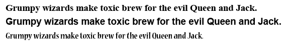
Not all fonts are created equal
In the following example, you can see that 14 pt bold Times New Roman does not render the same size as 14 pt bold Arial or 14 pt bold Nueva Standard Condensed.
Fortunately, WCAG color contrast guidelines address this very issue. Here are three relevant snippets from the Understanding 1.4.3 page.
"18 point" and "bold" can both have different meanings in different fonts but, except for very thin or unusual fonts, they should be sufficient. Since there are so many different fonts, the general measures are used and a note regarding fancy or thin fonts is included.Fonts with extraordinarily thin strokes or unusual features and characteristics that reduce the familiarity of their letter forms are harder to read, especially at lower contrast levels.For many mainstream body text fonts, 14 and 18 point are roughly equivalent to 1.2 and 1.5 em or to 120% or 150% of the default size for body text (assuming the body font is 100%), but authors would need to check this for the particular fonts in use.
It’s clear from the previous font example that Nueva Standard, even at a point size that passes compliance tests, is too small to reasonably consider passing AA. This is because the font renders smaller and the unusually thick and thin lines make the font difficult to read at this size. MCD recommends a 4.5 to 1 ratio here even though 3 to 1 is compliant.
Something important to note is that color contrast checkers and accessibility testing tools do not yet take a font’s actual rendering dimensions, line thickness or unusual shapes into consideration. Current tools only validate based on color contrast and the user agent’s reported font size.
Not all sizes are created equal
As a continuation of the second gotcha, it stands to reason, a smaller font size for Arial should still meet the level AA compliance for large text.
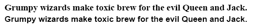
In this example, you will likely agree that Times New Roman 14 pt bold and Arial 12.8 pt bold look very similar in size and readability. Arial is slightly more readable, despite being “smaller” because it’s a sans-serif font. WCAG guidelines clearly state that 14 pt bold is considered large text for mainstream body text fonts and that Times New Roman is one such font because it’s the default font for all web browsers. Since Arial 12.8 pt (17px) bold looks so similar in size and readability, it should be considered large text for the purpose of meeting AA compliance. That said, today’s accessibility testing tools will flag this as noncompliant. Perhaps in the future, fonts could contain accessibility information that informs the user agent of minimum point sizes needed to meet different contrast ratios for that particular font.
Conclusion
Fonts come in all shapes and sizes. In the end, what really matters most, more than ticking a box on a checklist, is usability. While some site owners have legal obligations to meet accessibility compliance, it’s important to remember why there are guidelines in the first place.
If you're interested in testing out color combinations yourself you can use a color contrast checker.